Vancouver Public Library Redesign
#Redesign #HeuristicEvaluation #VancouverPublicLibrary #Application
Role
Evaluator
UX/UI Design
Type
IOS Device
Heuristic Evaluation
Redesign
3 Weeks
Summary
A heuristic evaluation is a usability inspection method that helps to identify usability problems in user interface design. Through choosing a core task and conducting a heuristic evaluation on the existing Vancouver Public Library application, usabilities issues are found and improvements are implemented on the new design.
About
Vancouver Public Library App
Vancouver Public Library has been dedicated to meeting the lifelong learning, reading and information needs of Vancouver residents for more than 100 years. Citizens visits the library to borrow physical and digital items including books, ebooks, movies, music and magazines.
The Vancouver Public Library app is a companion to the Library. It assists users in accessing the library catalogue, their profiles, branch locations and other services with their own digital devices, providing efficiency and ease.
Brand Identity
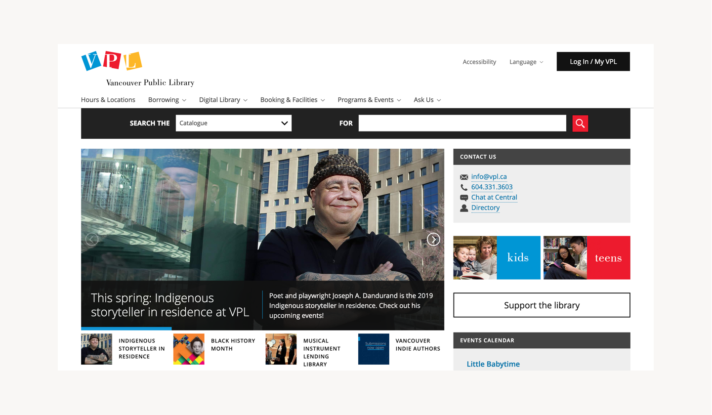
The redesign has to follow the current brand identity. Here is the logo and brand colours of the Vancouver Public Library.
Core Task:
Searching for availability of an item.
Goal
The goal of this project was to identify major usability flaws in the Vancouver Public Library application using established heuristic evaluation techniques.
This evaluation focused on the core functionality of the application, which is searching for availability of an item.
Usability Score Scale
A score scale of 1-5 is developed referencing Jacob Nielson’s four-step scale for usability problem severity.
1 = Usability catastrophe: imperative to fix this before product can be released
2 = Major usability problem: important to fix, so should be given high priority
3 = Minor usability problem: fixing this should be given low priority
4 = Cosmetic problem only: need not be fixed unless extra time is available
5 = I don't agree that this is a usability problem at all
Key Discoveries
Based on the chosen task, there are 15 main issues found in 8 different heuristics. The area of improvements are then focused on:
Consistency internally and externally
Error prevention when searching for an item
Accessibility of important informations and actions
The following are the details of significant issues found based on heuristics.
1. Visibility of System Status
Issue #1
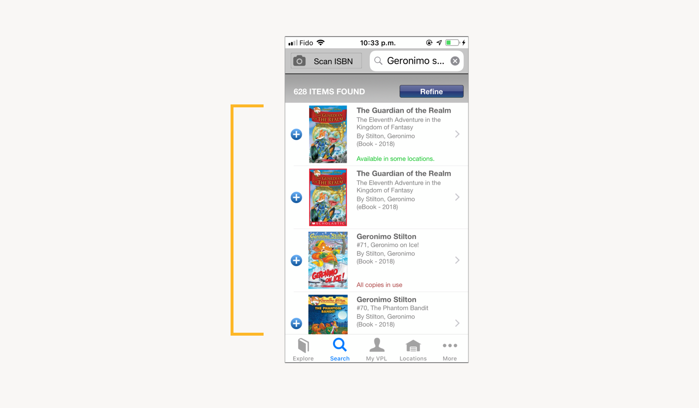
Search result sorting method unknown
Items on search list after searching does not seem to be sorted by any particular order. Users have no way to find out how it is sorted, and have no control over it. It might affect user’s efficiency on finding their wanted item when there is a large search result.
Score:
3/5 (Minor)
2. Match Between System and Real World
Issue #2
Language does not correspond with user terminology
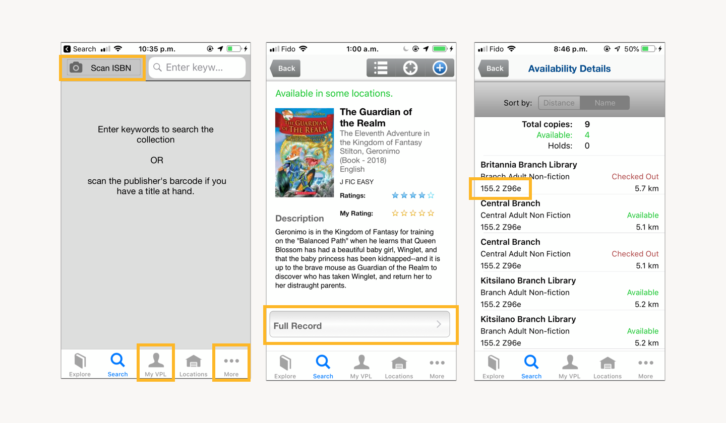
Users might encounter trouble understanding certain terminologies without guidance, or increase their cognitive load understanding them, such as “ISBN,” “Full Record,” and “005.75 A11K9d1.”
“My VPL” is not a common term that is widely used, where it increases user’s cognitive load to understand the term. Use of the term “More” is not informative about what kind of information/navigation/function is contained within the tab.
Score:
3/5 (Minor)
3. User Control and Freedom
Issue #3
Selecting multiple filter is time consuming
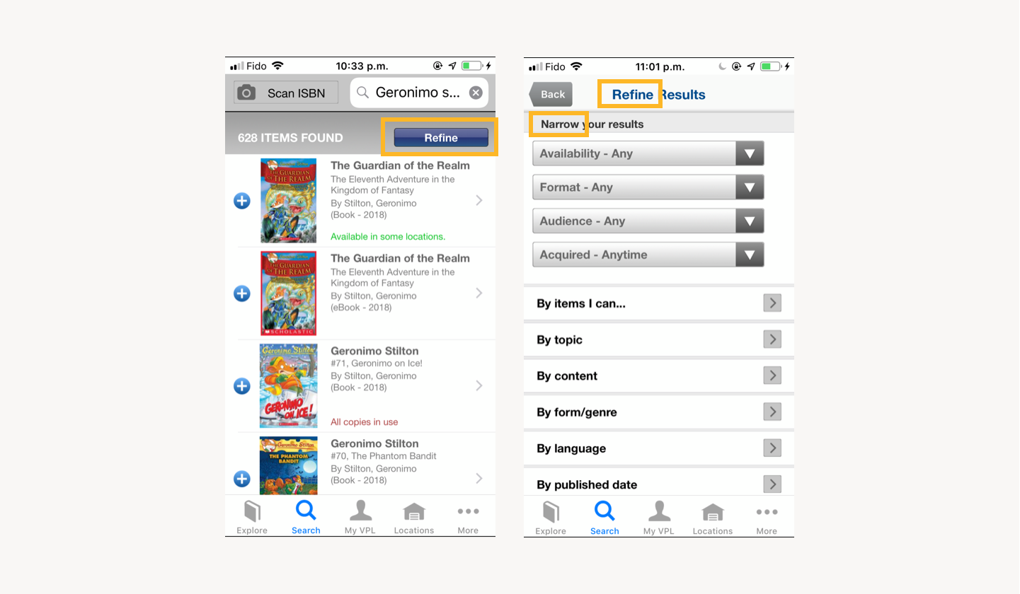
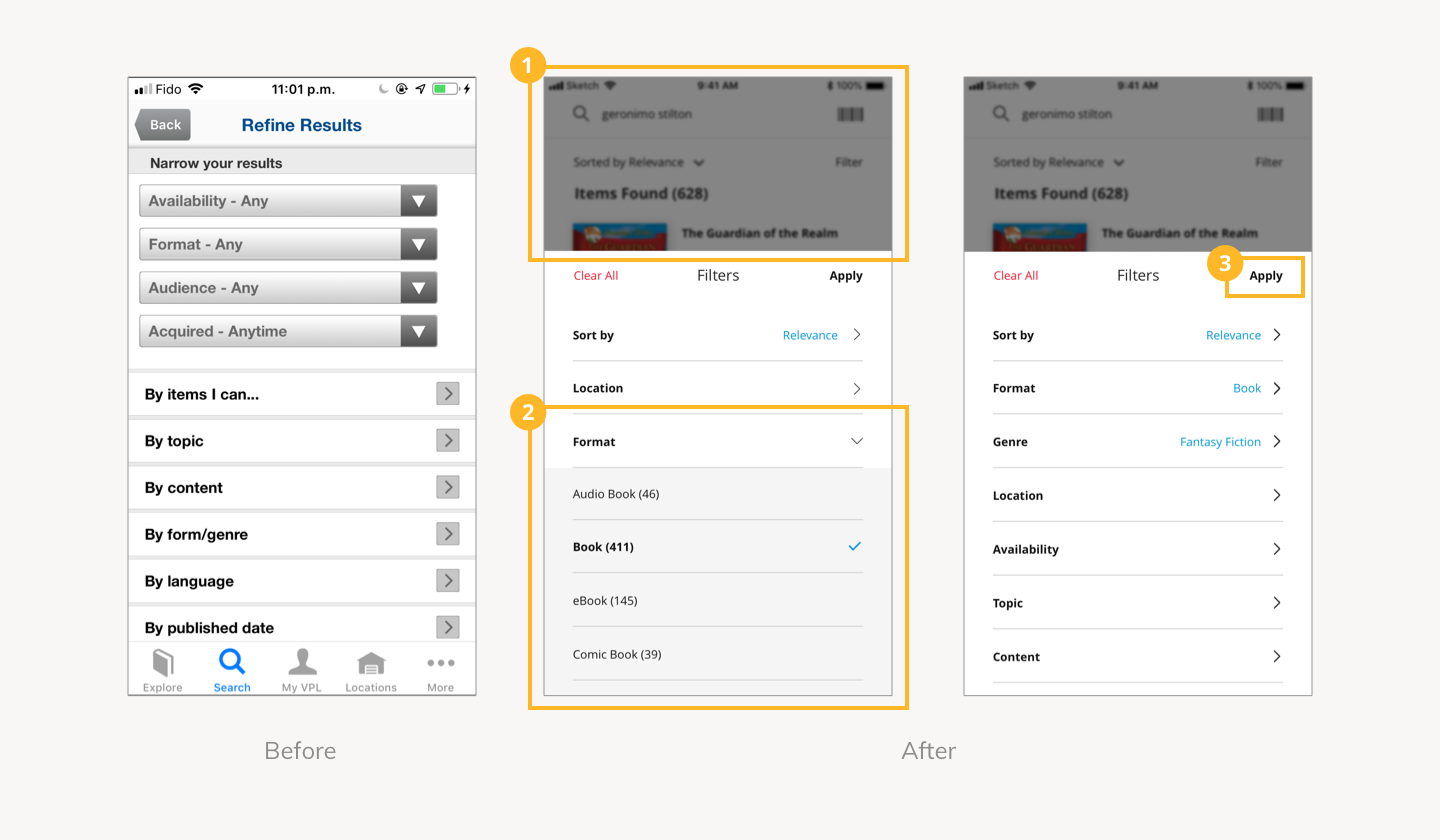
Users can only choose one filter at a time rather than multiple at the same time. When they want to choose multiple, they are forced to repeat the whole process of entering the filter page as they are automatically pushed back to the search result page after choosing one filter.
Issue #4
Availability sorting options limits user control
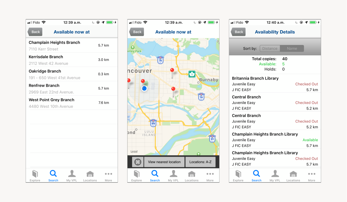
The current sorting option only includes distance and name. When users want to borrow the item from an available branch, they will have to scroll through both available and not available locations, which is not convenient for the user.
Score:
3/5 (Minor)
4. Consistency and Standards
Issue #5
Inconsistent language use
Use of terminology of the same function is not consistent within the system, where the filter option is described with 3 different terms: Refine, narrow and filter.
Issue#6
Misleading tab bar icon
Although labeled, the house icon is more commonly associated with home page instead of location, which might confuse the user.
Issue#7
Button placement
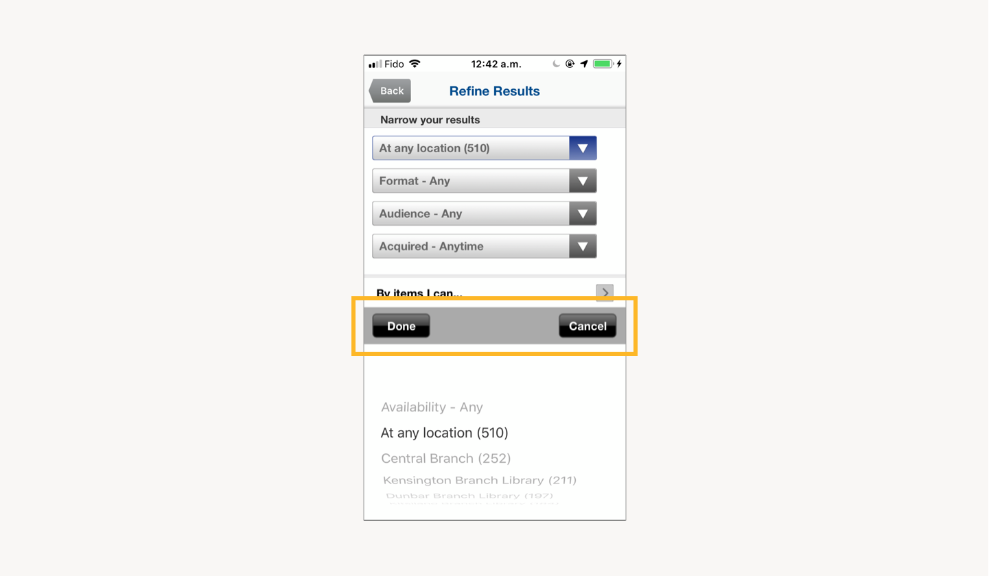
In the app, the done button is placed on the left and cancel is to the right. According to the MacOS guideline, the button that initiates an action should always be furthest to the right and the cancel button should be to the left of this button. Not following the common convention increases the chances of error.
Score:
2/5 (Major)
5. Error Prevention
Issue#8
Search box is prone to error
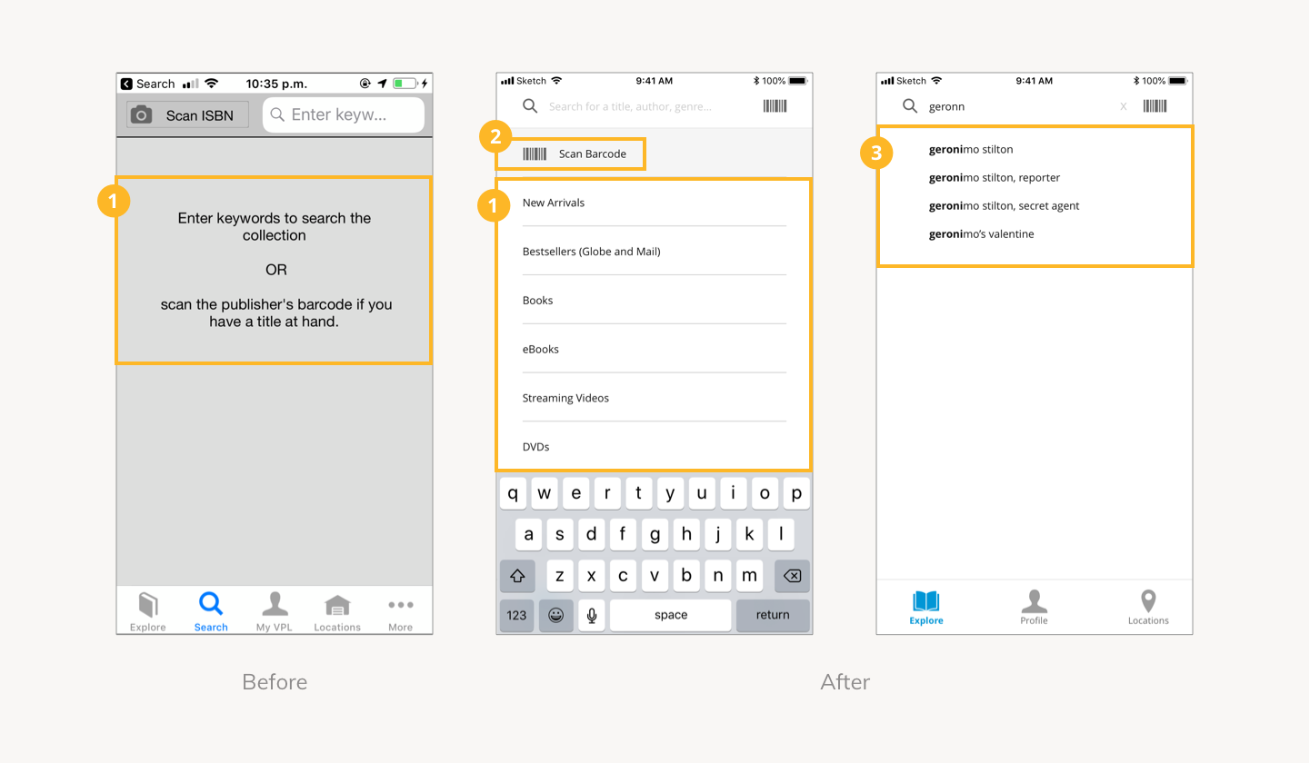
There are no error prevention at all in the process of typing in a keyword that has no direct matches, including if the user accidentally made a typo, which is a common error when using a touchscreen.
When there are no direct matches, the system does not suggest any easy way to recover other than having the user to retype their search query again.
Score:
2/5 (Major)
6. Recognition Rather Than Recall
Issue#9
Users have to recall chosen filters
Although chosen filters are shown on the filtering page, they are not available on the search results page. Filter applied to search results is only indicated with a tick on the “refine” button. Users will have to recall how many filter(s) and what filter(s) they have picked which is inconvenient.
Issue#10
Search box space is squished
Half of the search box space is taken up by the “Scan Icon” label and icon, where the keywords that users used to search is barely visible, only showing 10 characters at a time.
Issue#11
Ambiguous call to action button
On the item details page, all available call to actions are under the icons on the top right corner, where it is unclear what the icon represents. Users will have to click on each one to figure out what each button represents.
This also includes information on details of item availability and putting an item on hold which is a core function for people who uses the Vancouver Public Library application.
Score:
2/5 (Major)
7. Flexibility and Efficiency of Use
Issue#12
Item availability information is scattered
The details of item availability exists on three different individual pages within the item detail page, and they all contain different valuable information. It takes a lot of effort for the users to navigate and gather all related information when needed.
Issue#13
Hidden recommendations on explore tab
The explore tab is the first screen every users will encounter when opening the application. However, most items to explore were hidden within sections, which is not visible to users and does not encourage exploration.
Books showed under “recently reviewed” are also showing all items that are recently reviewed by anyone instead of showing content relative to the user’s interest, which is excessive information for the user.
Score:
2/5 (Major)
8. Aesthetic and Minimalist Design
Issue#14
Excessive use of gradient and insufficient spacing
Excessive use of gradient increases the load time of screens as well as user’s cognitive load. Minimal line length and spacing between sections also makes the overall interface look crowded, giving no breathing room.
Issue#15
Brand typeface consistency
The current Vancouver Public Library application typeface choice is not consistent with their website, where the design of the website was with better consideration overall when compared.
Typeface used on the Vancouver Public Library website is Open Sans, and the current typeface used in the application is Helvetica.
Score:
3/5 (Minor)
Overall Average Score
From the average heuristic score, we could see that the current Vancouver Public Library application definitely has major and minor usability problems that could be fixed to improve the overall experience of the design.
Sketches
Sketches are then drawn to explore a range of improvement possibilities based on the issues found that could be implemented on the redesign. The sketches will then be digitised using Sketch.
The Redesign
Tab Bar
Book Icon: changed to open book suggesting exploration.
House Icon: changed to pin to indicate location.
My VPL: changed to a more common term “Profile.”
More: functions and information within are now accessible through other parts of the application.
Overall: reduced amount of tabs, showing only the most important destinations.
Explore
Recommended items are laid out where users can see them visually, encouraging exploration as the tab suggests.
Search is combined with the explore page, as searching for an item is very likely the primary action for users, it should be accessible immediately.
Search
Original content is replaced with categories, since it was not informative. Users know that they are using the search box to search for an item.
ISBN: changed to barcode icon and the word “barcode” that corresponds with user terminologies.
Search prediction is added to predict user’s search query, decreasing the chance of error. Even if users make a typo, it would suggest items that would match with existing items within the library’s collection.
Search Results
Scan icon is minimised to reveal more of the user’s search query.
Provides visibility on how items are sorted, and give user the control on choosing the sort order for easier searching.
Chosen filters are shown on the results page so users don’t have to recall.
Filter
Users are able to see what they were searching for while applying filters, helping them with their decision making.
Applying multiple filters at once is possible now as users can click on apply after they have chosen all the filters they need, instead of being forced out of the page after picking one.
All filter items are using a drop down menu, where previously some are drop down menu and some has to go to another page to apply which is inconsistent.
Item Details
Hidden call to actions are now all visible the moment the user enters the page. Main action of “add to shelf” or “place hold” are on a fixed footer, so it is always accessible even while users are scrolling through the page.
Overall information hierarchy has improved, with more breathing space.
Availability Details
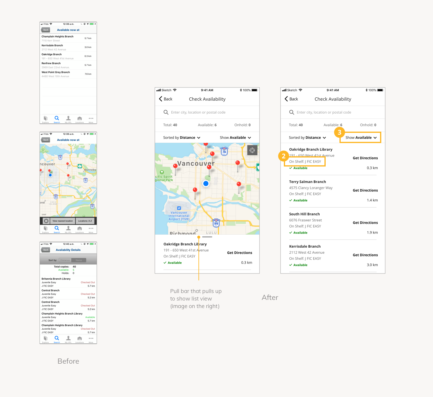
The 3 separate pages of availability details are now combined to 1 page.
Shelf location is labelled for better understanding.
Filtering option of showing only available items is added for flexibility and efficiency of use.
UI Library
A UI library is built to document all elements in order to keep the designs consistent and re-usable.
Reflection
Although heuristic evaluation could not replace user testing, it helped me develop a sharper eye for looking at potential usability problems, and come up with ways of improving it when looking at different interfaces. This process also led me to be more aware of these principles while designing interfaces.


