Do you hate me too?
#ComicSans #MostHatedFont #Typography #Exhibition
Role
Graphic Design
Art Direction
Type
Exhibition Design
Summary
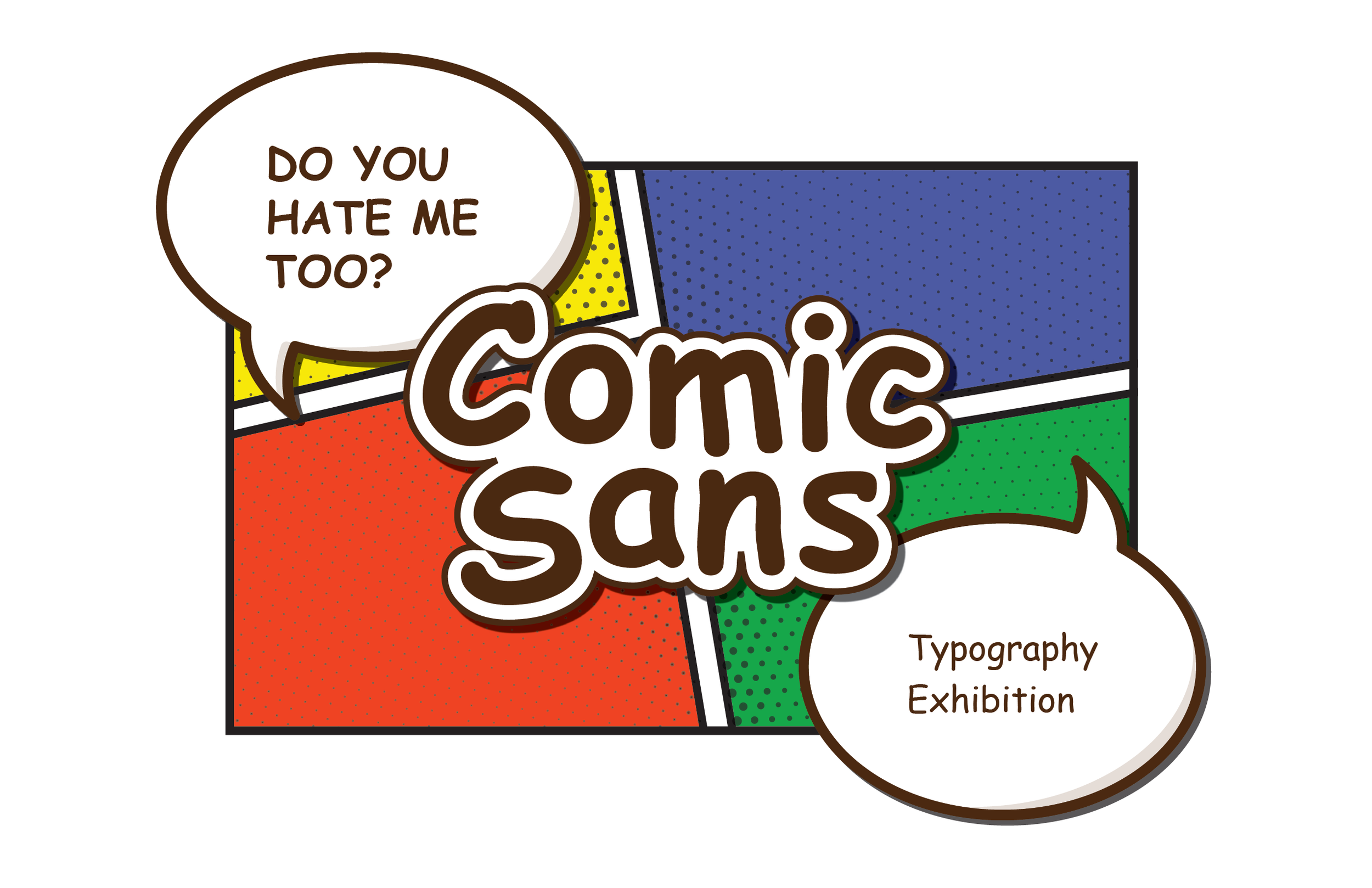
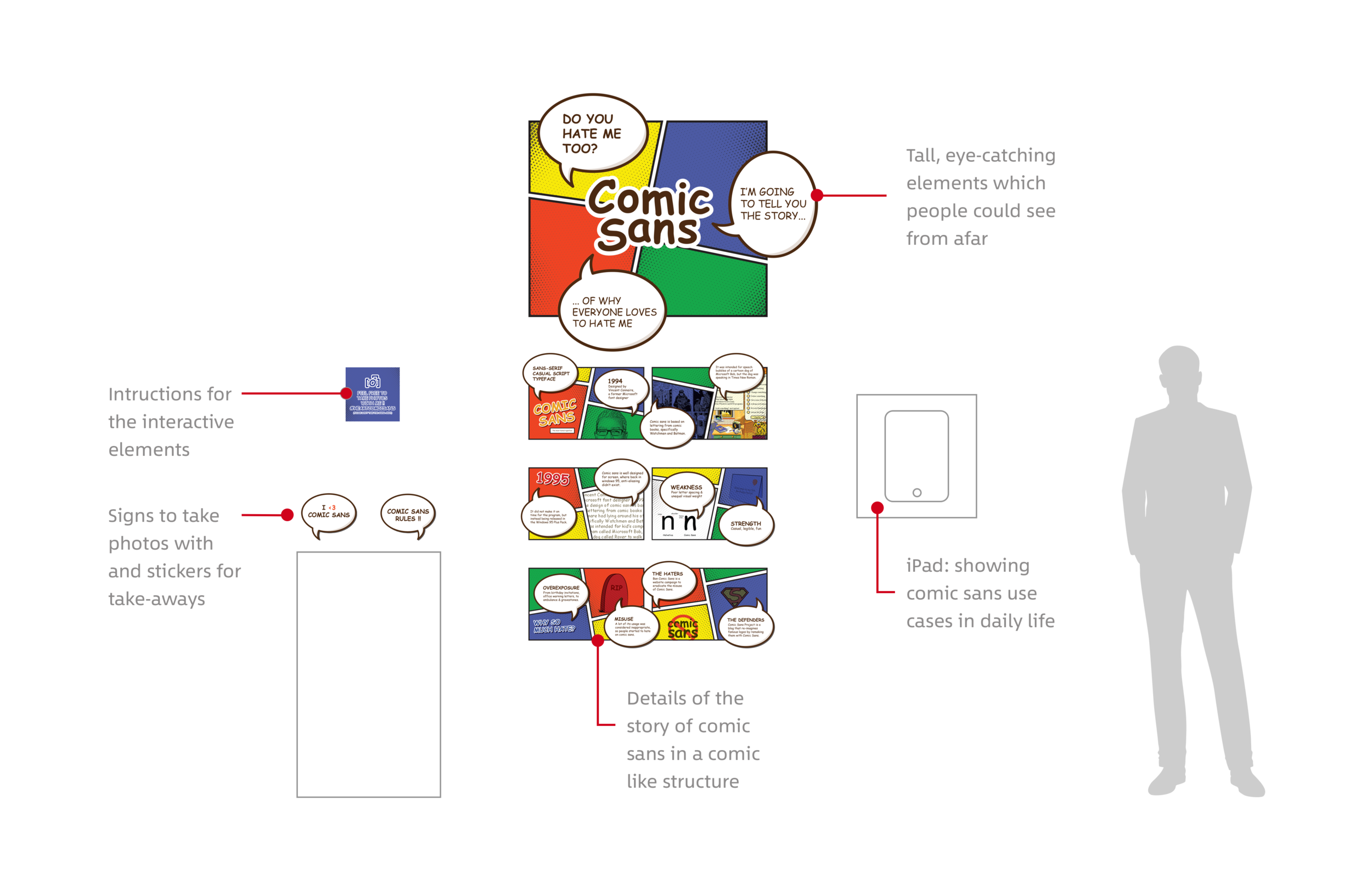
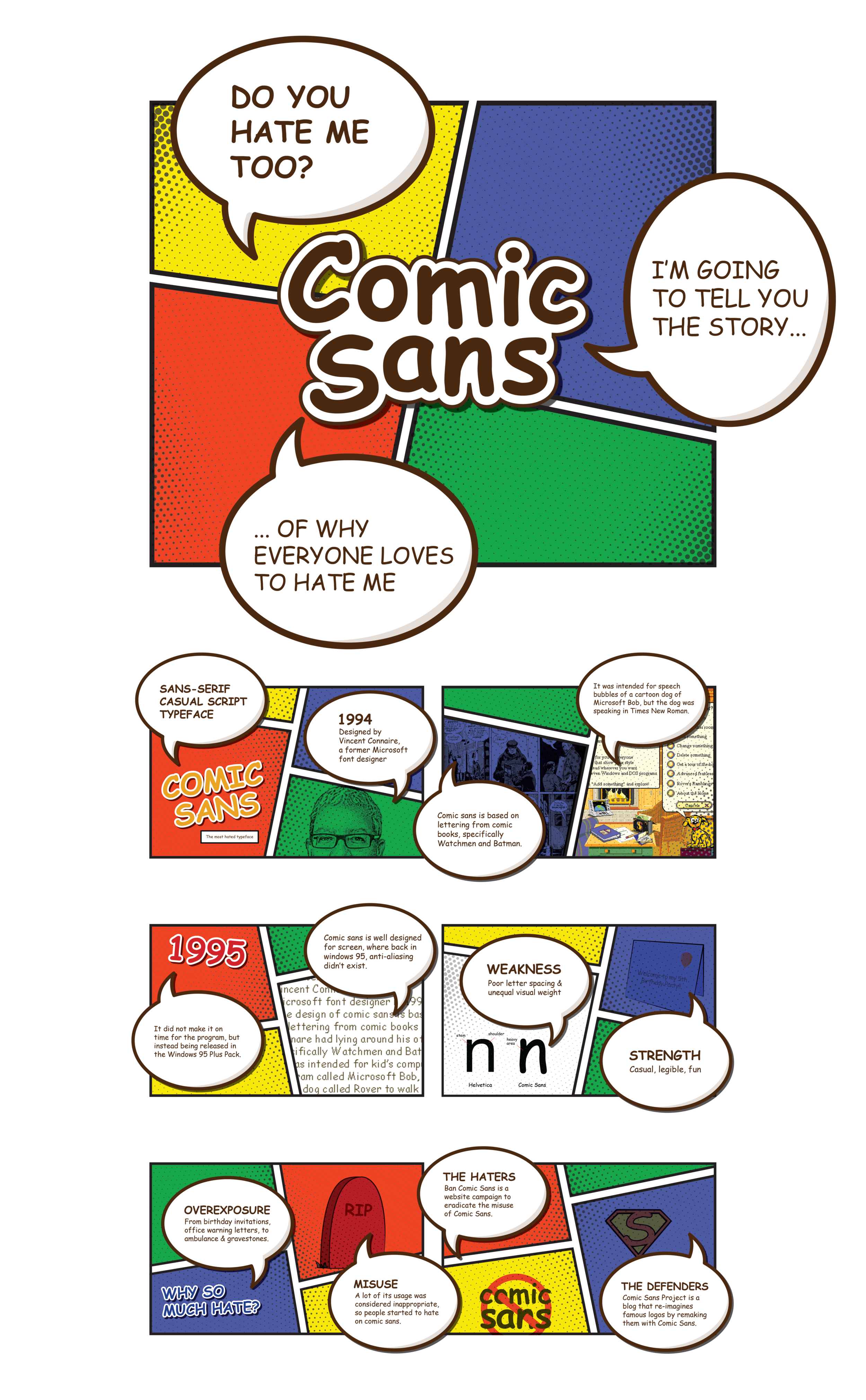
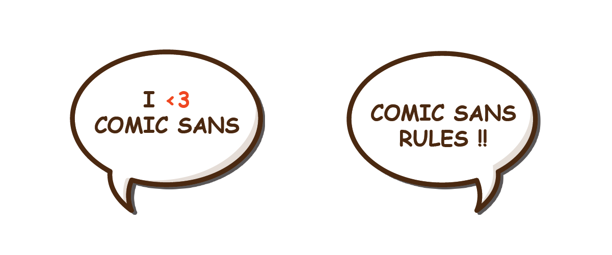
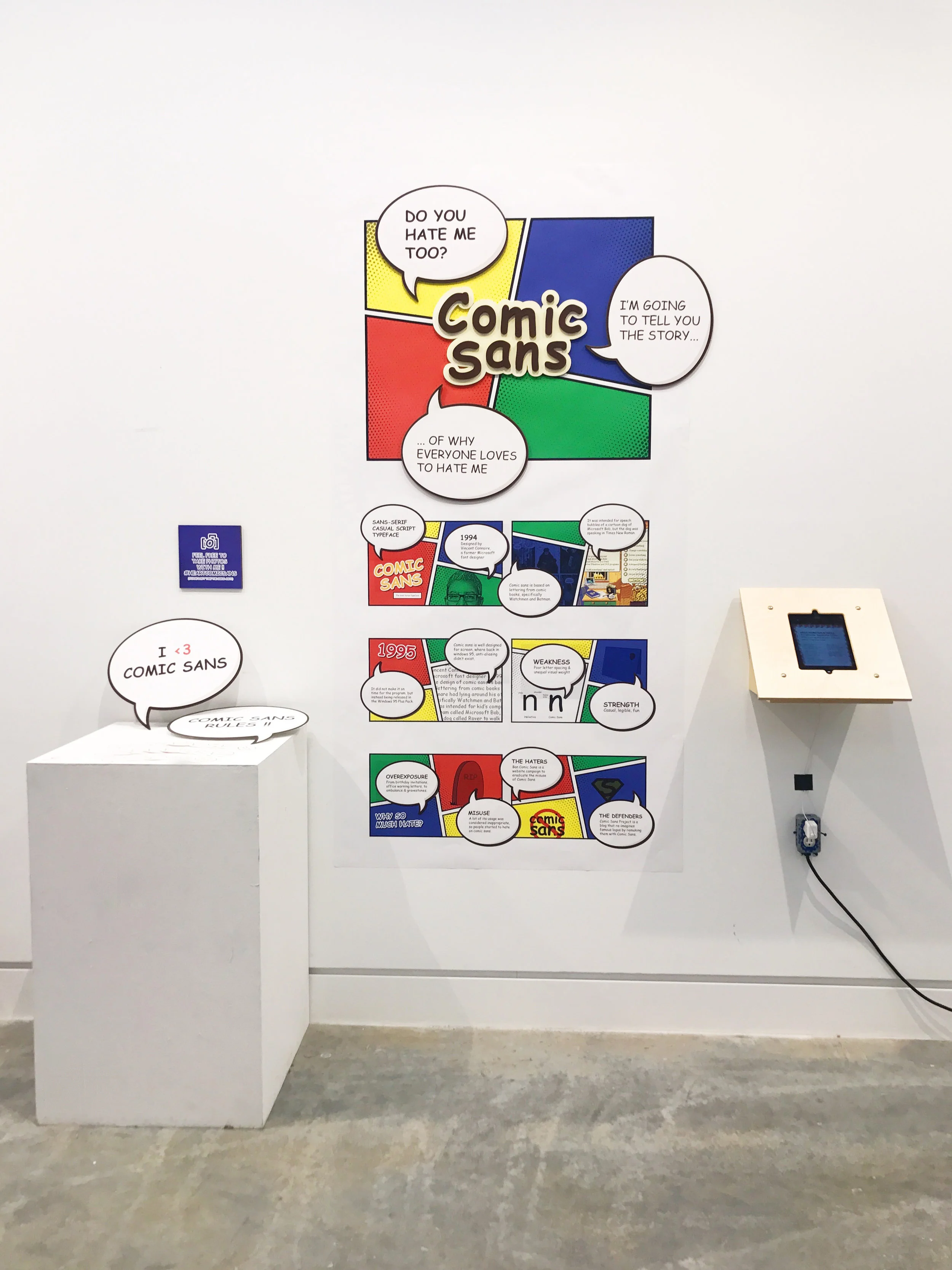
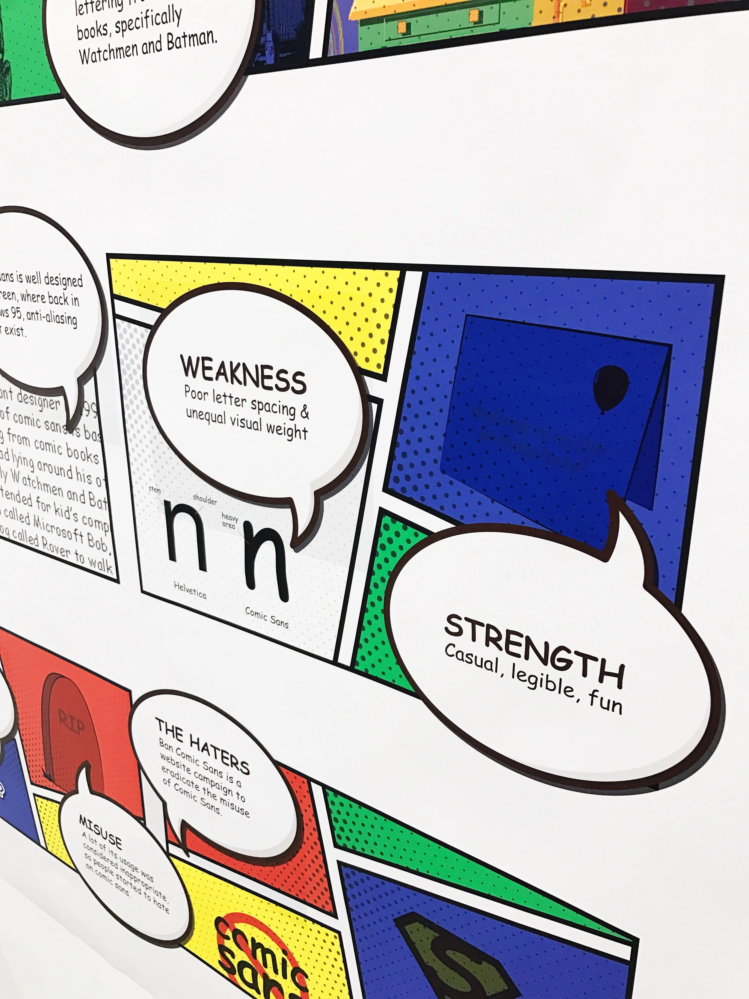
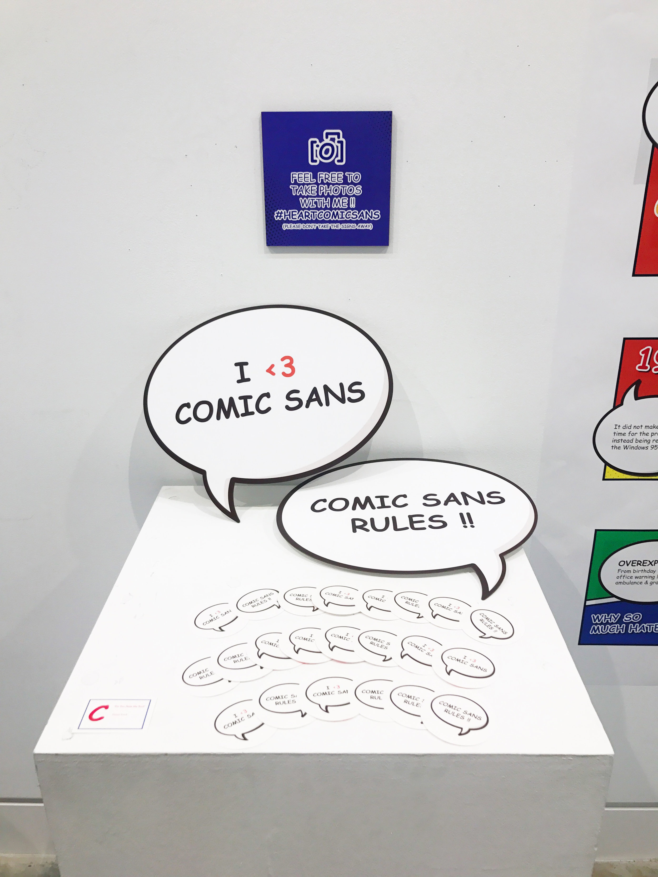
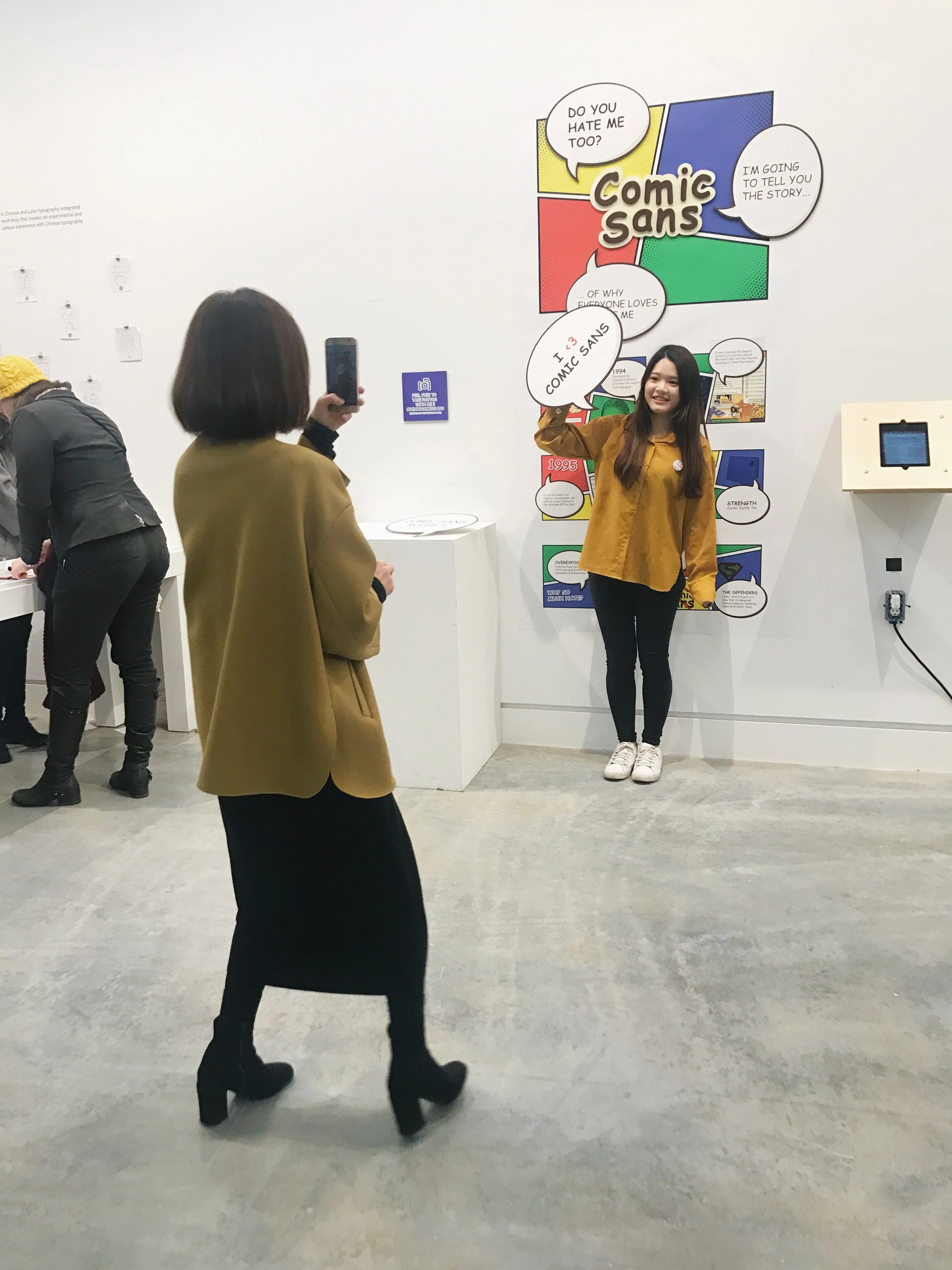
Do you hate me too? is an exhibition piece aiming to bring the audience to the world of typography through the lens of the popular culture - the most hated typeface Comic Sans. The exhibition educates people on the history and technicalities of comic sans in a comic book-like style, and invites people to interact with the exhibit using their social media.
Moodboard
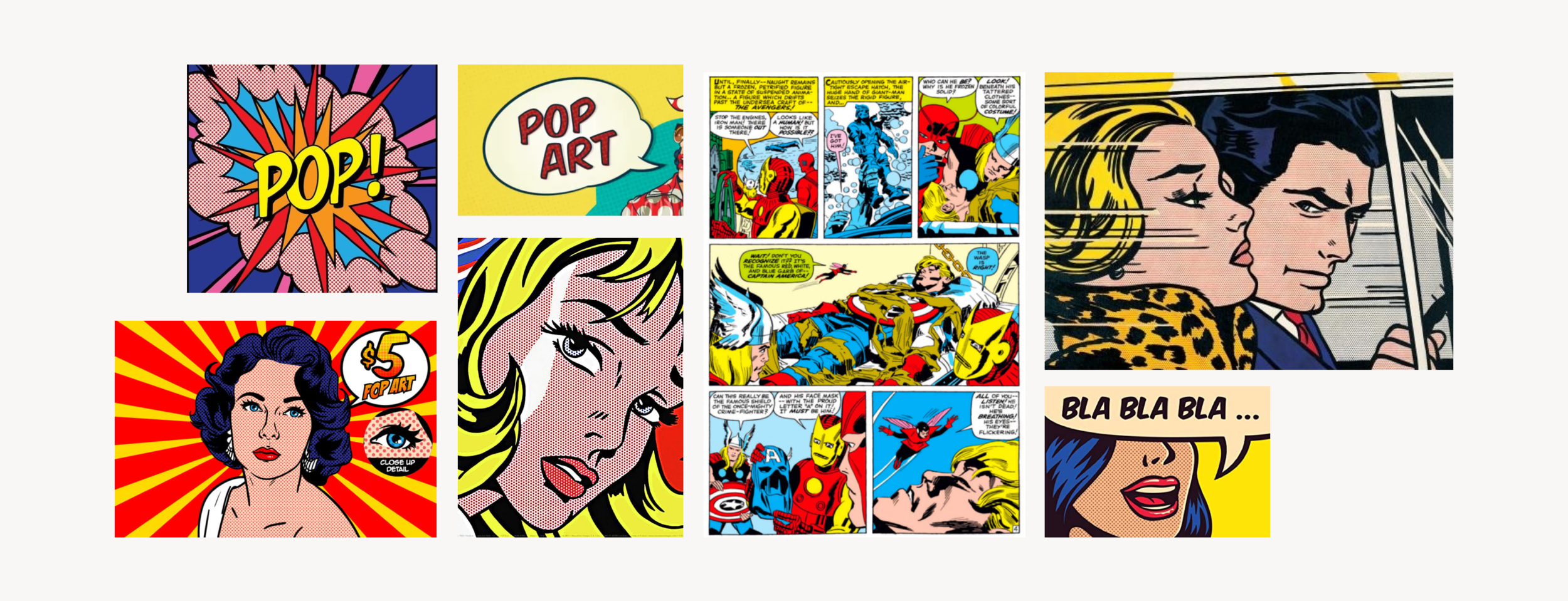
For the visual direction, I referenced pop art, which it also referenced a lot of visual style from the comic books. Because the design of comic sans, well clearly, was inspired by comic book fonts. The visual design of this exhibition captures the high energy, playful, bold quality of pop art designs.
The pop art movement presented a challenge to traditions of fine art, where it fits the concept of this exhibition, bringing the most hated typeface to be used in design under the light in an art space for open discussions.
Sketches
Concept
The Pop-Up Type Museum is an annual installation, loaded with fun-filled, educational, interactive typographic exhibits, held in Emily Carr University of Art + Design. People who would be viewing or walk pass the exhibition might or might not have a deep understanding on typography, yet I am sure everyone has heard about Comic Sans.
It is definitely a well-aware subject, where everyone knows to make fun of people who uses it. But how many people knows the story behind it? I wanted to engage the audience in a humorous and inviting way into the world of typography.
